Matplotlib
-
Matplotlib is a data visualization library in python used in 2D plots of arrays.
-
One of the greatest benefits of visualization is that it allows us visual access to huge amount of data in easy way.
-
Matplotlib consists of several plots such as bars , histogram , line , scatter , pie , area etc....
-
We can install by using following command in our Terminal :
- python -m pip install -U matplotlib
-
There comes a variety of plots
- Matplotlib Line Plot
- Matplotlib Bar Plot
- Matplotlib Histograms Plot
- Matplotlib Scatter Plot
- Matplotlib Pie Charts
- Matplotlib Area Plot
Matplotlib Line Plot
- A line plot is a type of plot used to visualize relationships between two continuous variables.
- colours , line style and markers can be set during plotting
x = np.linspace(0 , 3*np.pi , 200)

# defining the function
sin_y = np.sin(x)
cos_y = np.cos(x)

# plotting the function


plt.figure(figsize=(18,5))

plt.plot(x , sin_y , '*' , label ='Sin' , color='green' , linewidth=3)
plt.plot(x , cos_y , '+', label ='Cosine' , color='red' , linewidth=5)


plt.xlabel('X')
plt.ylabel('Sin and Cosine')

plt.title('Graph')
plt.legend(loc='upper right')

# for styling the graph
plt.style.use('seaborn-v0_8-dark')

# for saving the graph
plt.savefig('sine_cosine.png')

plt.show()
Basic styling:
- Alpha: Transparency of the markers in the scatter plot.
- Colorbar: A bar showing the colors used in the plot and the corresponding values.
- Colormap: A color mapping used to convert scalar data to colors.
- Edgecolors: The color of the edges of the markers in a scatter plot.
- Sizes: The size of the markers in a scatter plot.
Matplotlib Bar Plot
By using matplotlib library in Python , it allows us to access the functions and classes provided by the library for plotting. There are two lists x and y are defined . This function creates a bar plot by taking x-axis and y-axis values as arguments and generates the bar plot based on those values.
# importing matplotlib module
from matplotlib import pyplot as plt

# x-axis values
x = [5, 2, 9, 4, 7]

# Y-axis values
y = [10, 5, 8, 4, 2]

# Function to plot the bar
plt.bar(x, y)

# function to show the plot
plt.show()
Matplotlib Histograms Plot
By using the matplotlib module defines the y-axis values for a histogram plot. Plots in the , histogram using the hist() function and displays the plot using the show() function. The hist() function creates a histogram plot based on the values in the y-axis list.
# importing matplotlib module
from matplotlib import pyplot as plt

# Y-axis values
y = [10, 5, 8, 4, 2]

# Function to plot histogram
plt.hist(y)

# Function to show the plot
plt.show()
Matplotlib Pie Charts
By importing the module Matplotlib in Python to create a pie chart with three categories and respective sizes. The plot .pie() function is used to generate the chart, including labels, percentage formatting, and a starting angle. A title is added with plt. title(), and plt. show() displays the resulting pie chart, visualizing the proportional distribution of the specified categories.
import matplotlib.pyplot as plt

# Data for the pie chart
labels = ['Geeks 1', 'Geeks 2', 'Geeks 3']
sizes = [35, 35, 30]

# Plotting the pie chart
plt.pie(sizes, labels=labels, autopct='%1.1f%%', startangle=90)
plt.title('Pie Chart Example')
plt.show()
Matplotlib Area Plot
By importing Matplotlib we sky bluegenerated an area chart with two lines (‘Line 1’ and ‘Line 2’). The area between the lines is shaded in a skyblue color with 40% transparency. The x-axis values are in the list ‘x’, and the corresponding y-axis values for each line are in ‘y1’ and ‘y2’. Labels, titles legends , and legend are added, and the resulting area chart is displayed.
import matplotlib.pyplot as plt

# Data
x = [1, 2, 3, 4, 5]
y1, y2 = [10, 20, 15, 25, 30], [5, 15, 10, 20, 25]

# Area Chart
plt.fill_between(x, y1, y2, color='skyblue', alpha=0.4, label='Area 1-2')
plt.plot(x, y1, label='Line 1', marker='o')
plt.plot(x, y2, label='Line 2', marker='o')

# Labels and Title
plt.xlabel('X-axis'), plt.ylabel('Y-axis'), plt.title('Area Chart Example')

# Legend and Display
plt.legend(), plt.show()
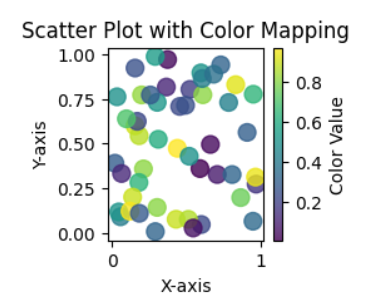
Scatter Plot with Color Mapping
In this example Python code uses Matplotlib and NumPy to generate a scatter plot with random data. The x and y arrays represent the coordinates, and the colors array provides color values. The plot includes a color mapping using the ‘viridis’ colormap, a color bar for reference, and axis labels. Finally, the plot is displayed using plt.show().
import matplotlib.pyplot as plt
import numpy as np

# Generate random data
np.random.seed(42)
x = np.random.rand(50)
y = np.random.rand(50)
colors = np.random.rand(50)

# Create a scatter plot with color mapping
plt.scatter(x, y, c=colors, cmap='viridis', s=100, alpha=0.8)

# Add color bar for reference
cbar = plt.colorbar()
cbar.set_label('Color Value')

# Set plot title and labels
plt.title('Scatter Plot with Color Mapping')
plt.xlabel('X-axis')
plt.ylabel('Y-axis')

# Display the plot
plt.show()
Axes class
Axes is the most basic and flexible unit for creating sub-plots. Axes allow placement of plots at any location in the figure. A given figure can contain many axes, but a given axes object can only be in one figure. The axes contain two axis objects 2D as well as, three-axis objects in the case of 3D. Let’s look at some basic functions of this class.
axes() function
axes() function creates axes object with argument, where argument is a list of 4 elements [left, bottom, width, height]. Let us now take a brief look to understand the axes() function.
x = np.linspace(0,10,50)
print(x)

fig ,ax = plt.subplots(2,2)

y = np.sin(x)
ax[0,0].plot(x,y)
ax[0,0].set_title('Sin Wave')


y = np.cos(x)
ax[0,1].plot(x,y)
ax[0,1].set_title('Cos Wave')

y = np.tan(x)
ax[1,0].plot(x,y)
ax[1,0].set_title('Tan Wave')


y = np.random.randn(1000)
ax[1,1].hist(y,bins = 40)
ax[1,1].set_title('Random Distribution')


plt.tight_layout()
plt.show()
ax = plt.axes(projection = '3d')

z = np.linspace(0,15,1000)
x = np.cos(z)
y = np.tan(z)

ax.plot3D(x,y,z, 'blue')
from mpl_toolkits.mplot3d import Axes3D
fig  = plt.figure()
ax   = fig.add_subplot(111, projection = '3d')

x = np.random.rand(100)
y = np.random.rand(100)
z = np.random.rand(100)

ax.scatter(x,y,z, c = 'red', marker = '*')

ax.set_xlabel('X')
ax.set_ylabel('Y')
ax.set_zlabel('Z')

plt.tight_layout()

plt.show()